6 min read
Qlik Reporting Service

In December 2021, Qlik launched the Reporting Service for the Qlik SaaS platform. The Reporting Service lets you generate static reports. These reports can then be distributed to internal and external recipients using the Application Automation functionality. In this blog we explain how it works and share a few tips so you can get started with this new functionality yourself!
Creating a report
Before you can start sending reports, you first need to decide what should go into the report. The Reporting Service builds the report from sheets in an existing Qlik dashboard. Put simply, the Reporting Service does the same thing as when you export a sheet from your dashboard yourself via the "Export to PDF" button. So in principle you could use your existing dashboards by feeding them one-to-one into the Reporting Service. However, if you want your report to look razor-sharp, for example because you also want to send it to your customers, it is advisable to design new sheets made specifically for generating the report.
It is important to adjust the size of your sheet to the format of your report. By choosing the right proportions right away, you can be sure the report comes out the way you intended. You change the proportions of a sheet under "Sheet properties" by setting the "Sheet size" to "Custom". For Width and Height we recommend 2480 by 3500 for an A4 in portrait mode.
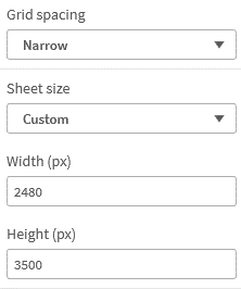
Set the size of your sheet to 2480×3500 so your report fits the page properly
You will notice that the chosen sheet proportions don't fit your screen by default, which can make it hard to get an overview of your entire report. Unfortunately Qlik has no zoom in and out option, but in most modern browsers you can zoom out by pressing CTRL and – at the same time. You zoom in with CTRL and +, and to return to the original size press CTRL and 0.
Now that the settings are right, it's time to design your sheet. You can use the Master Items you already created for the dashboard itself. Keep in mind, though, that you sometimes want to tweak the appearance of your objects for the static report. We therefore recommend copying your Master Item. Use the Tags functionality to easily tell the different Master Items apart.


Give the Master Items you use in your reports a unique tag so you can easily find them again
If you want to see what your sheet will look like while you are designing it, you can generate a preview by choosing "Download sheet as PDF" in the menu. Make sure you choose the right paper size and orientation.

Use the "Download sheet as PDF" functionality to generate a preview of your report
Sending reports with Application Automation
Once you are happy with the end result, it's time to send your report. Of course you can do that by exporting it manually with the aforementioned "Download sheet as PDF" functionality, but it is much nicer to automate this. You can do so using the Application Automation feature in Qlik SaaS. We previously wrote this blog about Application Automation, in which you can read how to put together different flows. New is the ability to use Templates to get you started. Qlik has created five templates covering different use cases for sending reports. In the example we choose the template "Send a simple multi-page report by email"

Use the application automation templates to automate the distribution of your report
Once you have chosen a template, all that is left is to pick the right parameters for the blocks in the template. In the "Start" block you specify when the task should start, for example weekly at 09:00. Then, in the "Variable – recipients" block, you specify which email addresses the report should be sent to. Of course you can also add your own logic here, for example to retrieve the list of recipients from an external source. In the "Create Report" block you choose the right app and give your report a name. The "Sheets mode" option has 2 settings. If it is set to "All", all sheets of the app are included in the report; with "Custom" you have to add sheets to the report yourself using an "Add Sheet To Report" block. Finally, you will always need to include a "Generate Report" block to actually have the report created. After this block you can set up the delivery. In our example that is an email, so we choose the "Send Mail" block. In this block you can specify the mail server and enter properties such as the subject and the mail body. Finally, add the report itself under the "Attachments" parameter. As soon as you save the automation it will be active, and your report will automatically be sent to the chosen recipients at the chosen interval.

Build your own logic for sending a report
Reporting Service versus Qlik NPrinting
If you have been working with Qlik software for a while, the story above may remind you of Qlik NPrinting. NPrinting is a Qlik extension for on-premise Qlik installations that also lets you generate reports based on your Qlik dashboards. The logical question is what the differences are with the Reporting Service. Below are the main differences:
- The Reporting Service is included for free in Qlik SaaS, whereas NPrinting has to be purchased separately.
- NPrinting is only available for on-premise installations and cannot generate reports on Qlik SaaS apps.
- NPrinting can generate reports in Microsoft Office formats such as Excel, Word and PowerPoint, whereas the Reporting Service only generates reports in PDF format.
- The Reporting Service works entirely in the browser, whereas NPrinting requires the designer application to be installed separately on the client machine.
- Thanks to the combination with Application Automation, the Reporting Service offers many more options for sending reports.
Want to know more?
Want to know more about Qlik Reporting or Qlik SaaS? Then get in touch with one of our account managers via the button below.
Stay up to date
Don't want to miss a blog? Sign up for our newsletter. That way you receive all the latest content straight in your mailbox every month. You can sign up using the button below.

Written by
